


The secret hidden behind the logos of the most famous brands
Did you know that...
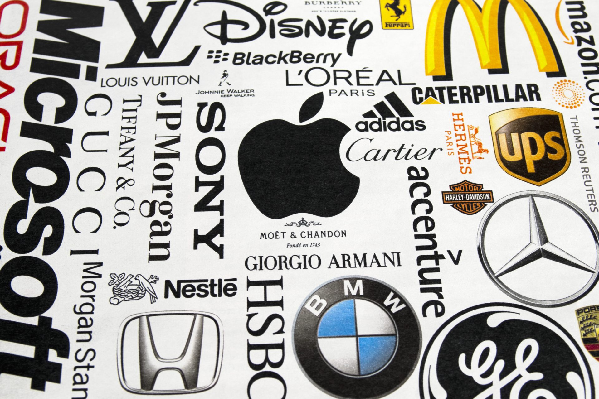
Famous logos are not just images but carefully designed visual representations encapsulating a brand's identity and values. Behind each logo is a creative and strategic process that involves research, design, and communication. Join us as we look at some of the curiosities hidden behind the most famous and well-known logos.
Logos that last over time
According to the website Puremarketing, some logos recognized as the best in the world, such as Apple, Nike, Coca-Cola, McDonald's, Pepsi, Mercedes-Benz and Facebook, share several characteristics that make them stand out.
What they all have in common
The most famous logos share these characteristics: They are simple, which makes them easily recognizable and memorable. Each has a rich history and legacy that reinforces its identity. They are associated with powerful brands and leaders in their respective industries. In addition, they are carefully designed to last over time, adapting to trends and maintaining their relevance over the years.
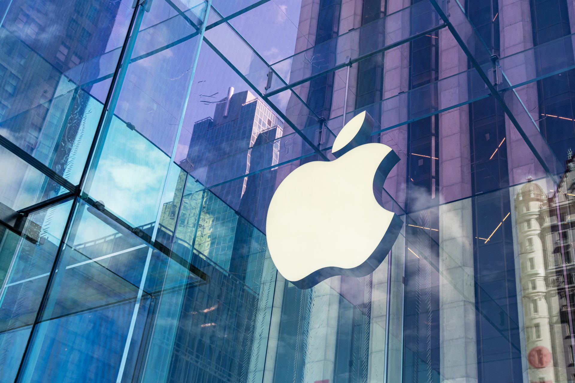
Apple
Apple, one of the most recognized brands worldwide, was founded in 1976 by Steve Jobs, Steve Wozniak and Ronald Wayne. Its logo, an apple with a bite in the upper right corner, has generated various theories, the most popular being the association with the story of Adam and Eve and the bite of the Forbidden Fruit, according to an article published on the website Crowdspring.
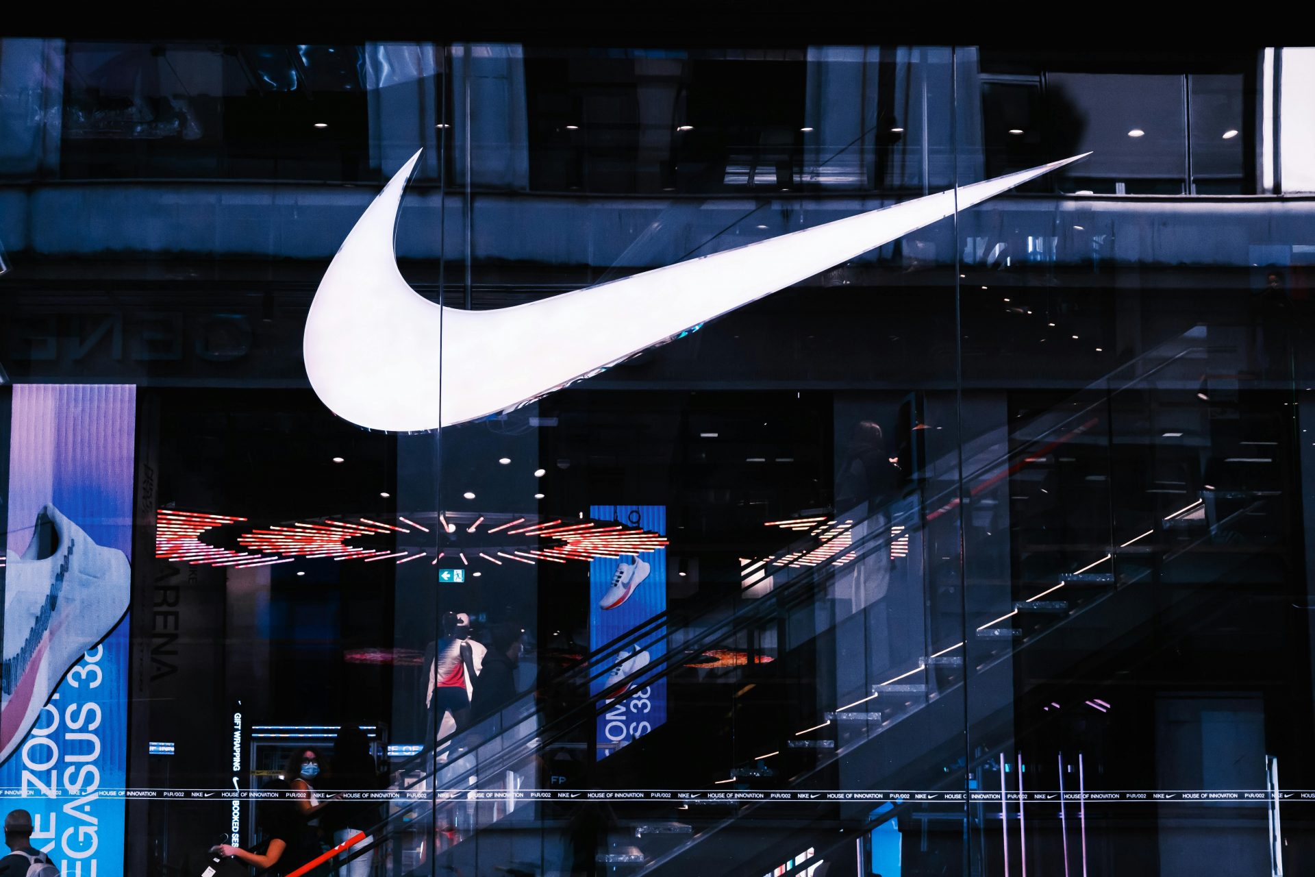
Nike
According to the website Branding Forum, nobody imagined that a logo that cost $35 would become one of the most famous. Design student Carolyn Davidson created the iconic Nike logo in 1971, inspired by the wings of the Greek goddess Nike (Greek: Νίκη). With a simple but impactful design, the brand conveys its vision.
Photo: Mathias Reding/Pexels
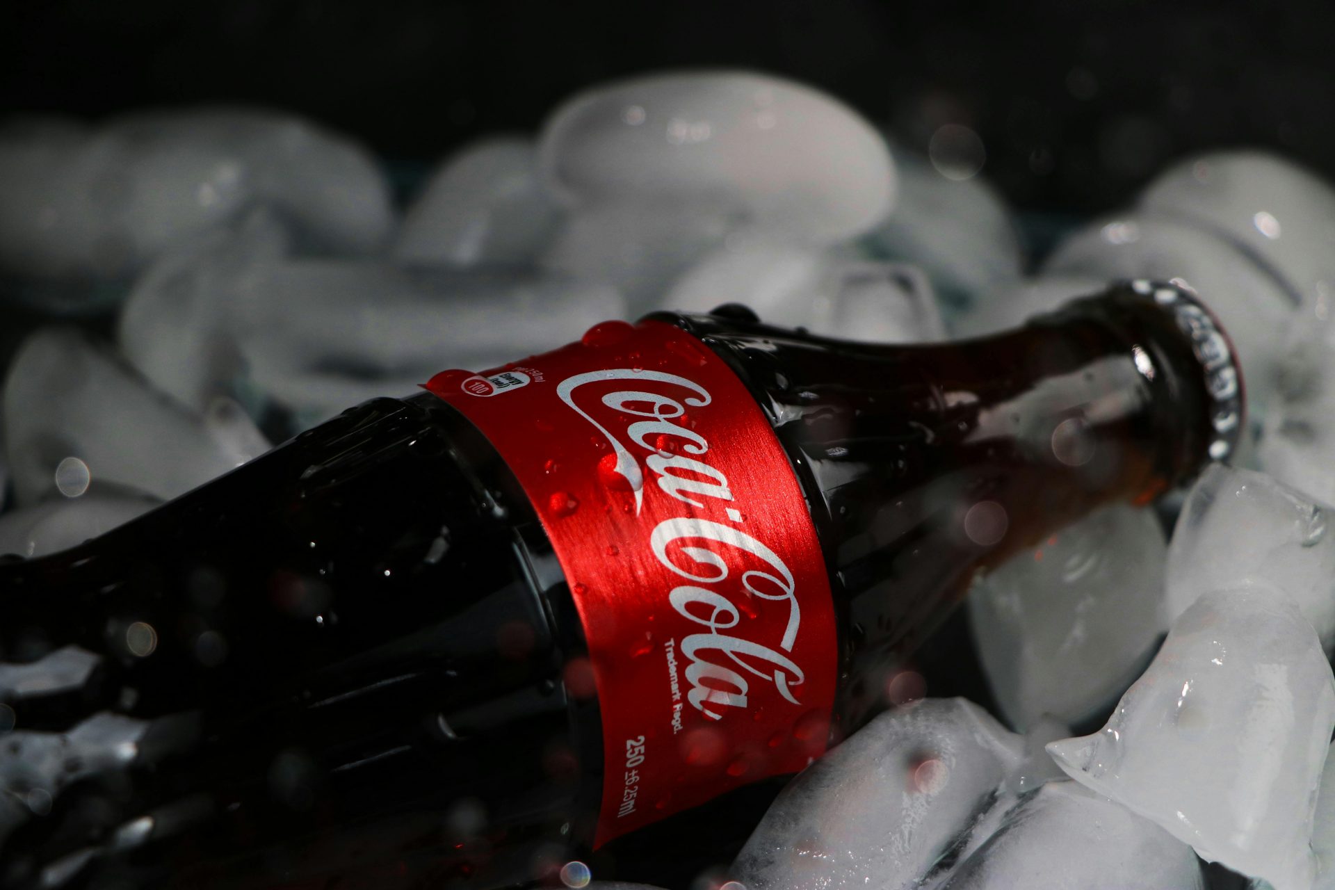
Coca Cola
According to the website Designbro, Frank Robinson, an accountant at Dr Pemberton, designed the famous logo using the Spencerian Script, thus laying the foundation for future designs. The choice of red color and influential graphics add charm to the logo, associating it with youth, optimism, purity and excellence.
Photo: Fafegh/Pexels
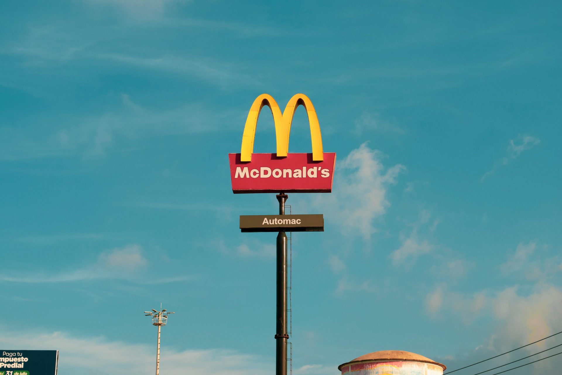
McDonald's
According to Crowd Spring, McDonald's iconic logo fuses two golden arches that are so recognizable that they surpass the fame of their food. Present on uniforms, buildings, and packaging, this logo, which looks like the letter M, has a symbolic meaning thanks to the architect of the franchise's first restaurant in 1952. With the golden arches on a red background, the logo represents the history of the brand, while red symbolizes the food industry. Additionally, it uses a unique font called McLawsuit.
Photo: Samuel Figueroa
Mercedes Benz
Mercedes-Benz has an inspiring logo history. The Daimler brothers, sons of the founder, created the famous logo based on a three-pointed star that their father had used to mark the location of their home. This idea, which symbolizes land, sea and air, reflects the company's drive for universal excellence. In 1926, the logo was modified, enclosing the star in a circle to represent its worldwide popularity. With its angles and 3D metallic shape, this badge became an iconic symbol for Mercedes-Benz.
Photo: Logan Hansen/Pexels
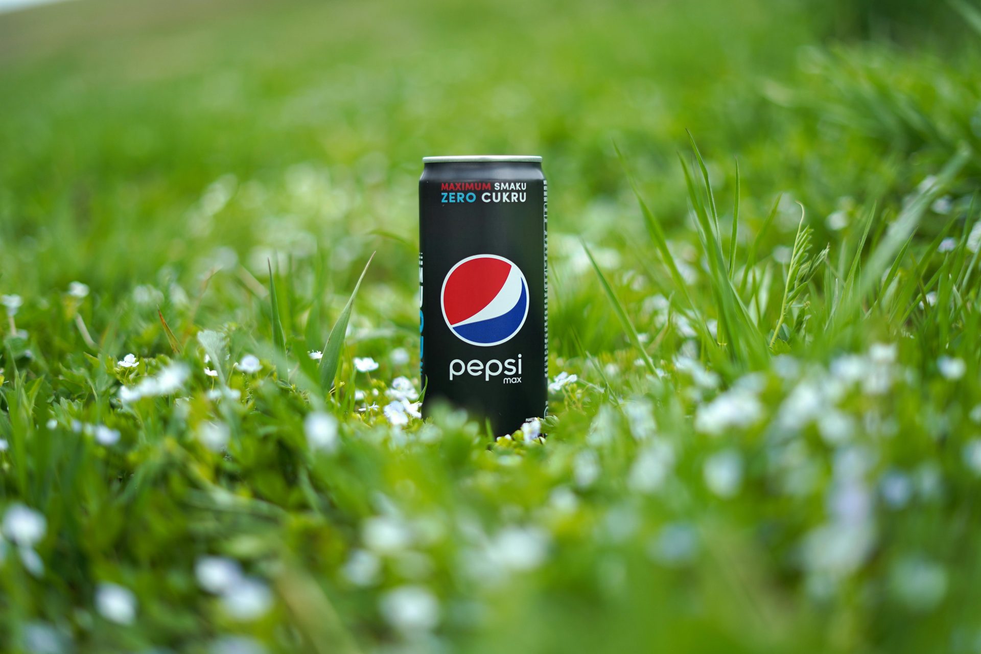
Pepsi
One of the most famous, the Pepsi logo balances modernity and timelessness with a wordmark in italics and a combination of red, blue and white in solidarity with the USA. During World War II, it always stood out among its competitors. In 2008, Pepsi offered more than $1 million to the Arnell Group to redesign its logo, resulting in an energetic new design that reflects the brand's digital presence.
Photo: Olena Bohovyk/Pexels
Memorable and recognized logos
Other logos that are also considered among the best in the world, such as those of Google, Amazon, Twitter, Adobe, Shell, BMW and Louis Vuitton, are true design icons. They have been meticulously designed to be memorable and easily recognizable. This focus on visual identity is essential to the success of these brands.
Google
The Google logo, created by Stanford University students in 1998, has undergone a historic evolution. From integrating interlocking Os to letters that jump off the page, Google is looking for responsive designs without compromising their integrity. Additionally, the choice of primary and secondary colors reflects the company's vision of not following conventional rules.
Photo: Sarah Blocksidge/Pexels
Amazon
The Amazon logo is recognized for its simplicity and subtle but effective message. It features an arrow that goes from the letter "A" to "Z," symbolizing the wide range of products offered by the company from the beginning to the end of the alphabet. This feature has been cleverly incorporated to convey the idea that Amazon has everything customers could need. Furthermore, the arrow-shaped smile at the bottom suggests customer satisfaction when making purchases on the platform.
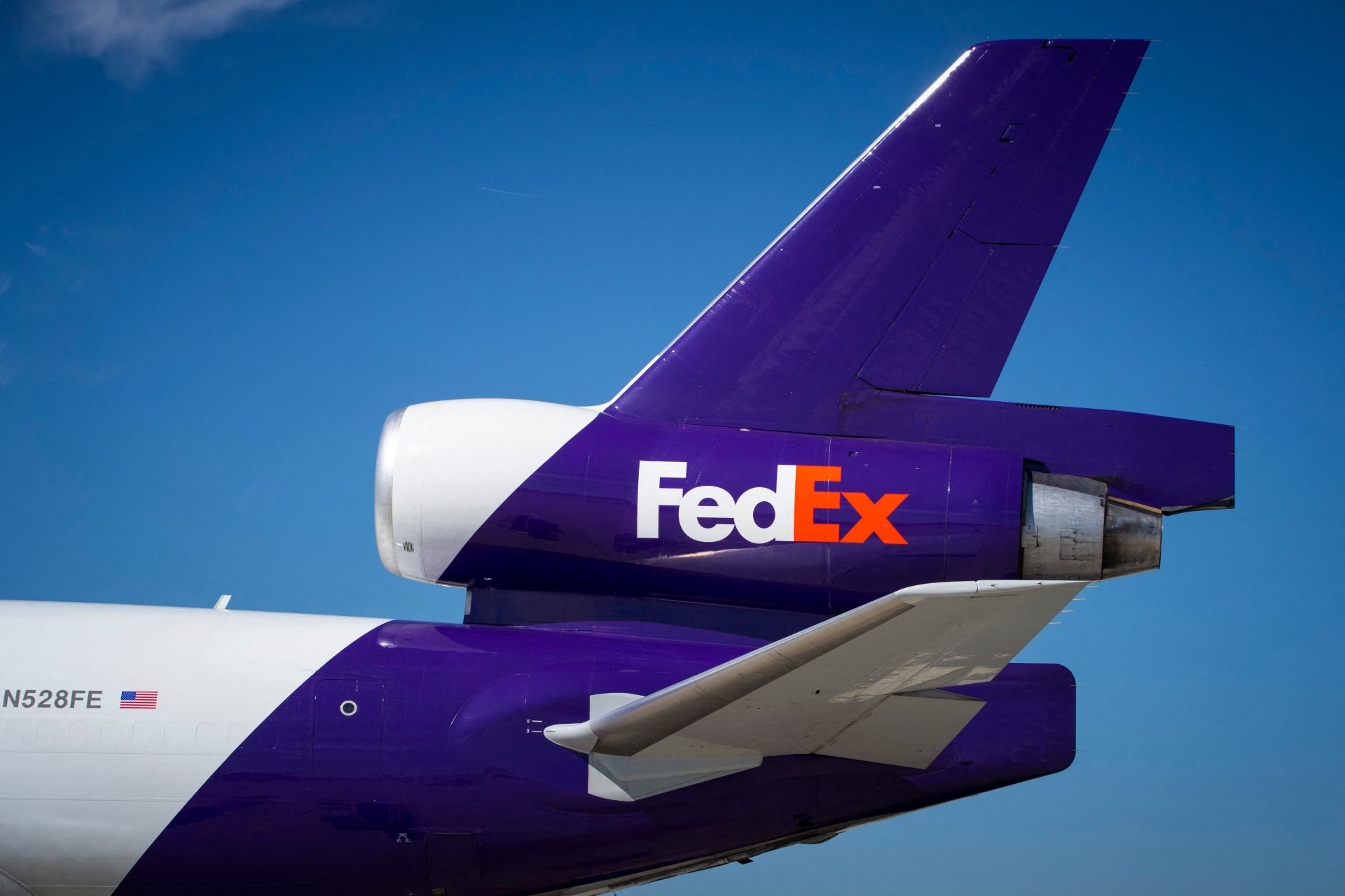
FedEx
FedEx is a widely recognized courier company whose logo is on vans and airplanes around the world. At first glance, its design isn't revolutionary. Still, it has one clever detail: Have you noticed the arrow hidden in the negative space between the "E" and the "X"? This arrow symbolizes forward movement with speed and precision, reflecting the FedEx brand philosophy.
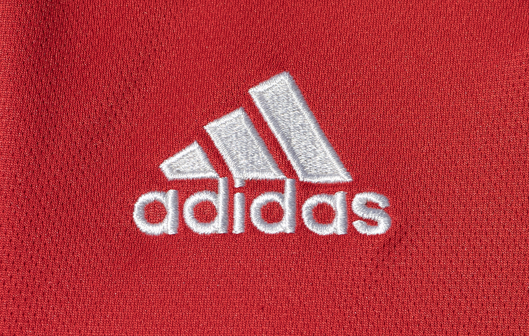
Adidas
The Adidas logo is one of the most recognized in the world of sports and fashion. It consists of three parallel stripes representing the mountains, symbolizing the challenges and goals to be achieved. This simple yet powerful design reflects the brand's philosophy of helping athletes overcome obstacles and reach their full potential. In addition, the three stripes also represent diversity and inclusion, which are fundamental values for Adidas. With its iconic design, the Adidas logo has come to symbolize quality, performance and style around the world.
Photo: Kaique Rocha/Pexels
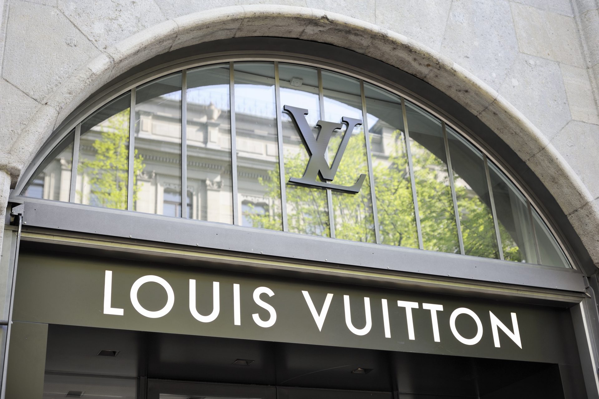
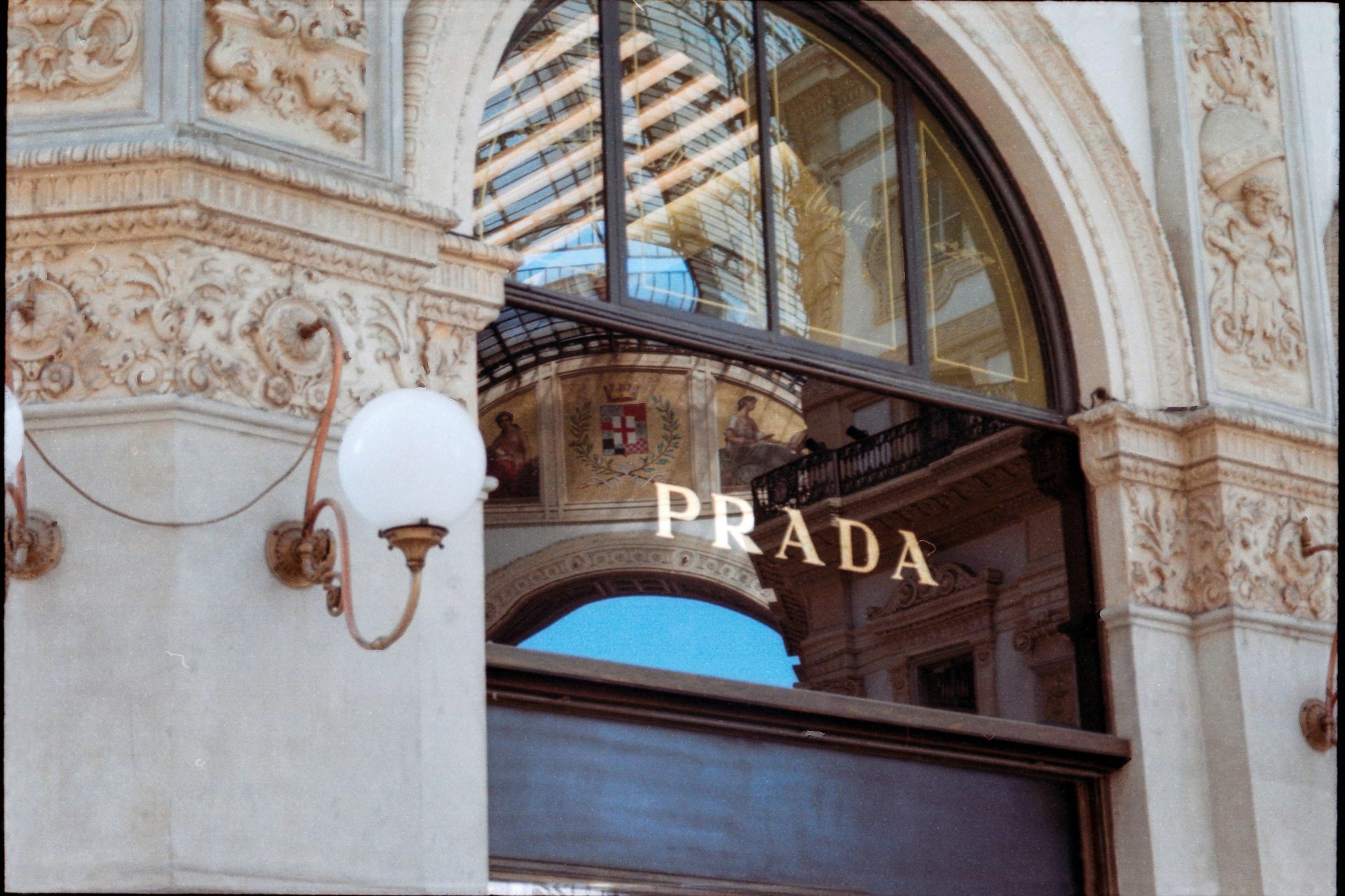
Prada
The Prada logo is a symbol of elegance and luxury in the fashion industry. It features the name "Prada" in an elegant and stylized serif font, accompanied by a coat of arms with an intertwined rope. This design evokes the brand's Italian heritage and family tradition, as well as its commitment to quality and timeless style. The Prada logo is recognized worldwide as an emblem of sophistication and distinction.
Photo: Fleur Van Deijck/Pexels
Toyota
The Toyota logo is an iconic symbol representing the Japanese automotive company. It consists of three overlapping ellipses that form a stylized "T," which represents the union of customers and the brand. Additionally, the two larger ellipses symbolize the heart of the company and the world in motion, while the smaller ellipse represents Toyota's technology and infinite future potential. This simple yet powerful design reflects Toyota's vision of constantly moving forward and staying at the forefront of the automotive industry.
Photo: Gautam Sudarsan/Pexels
Audi
The Audi logo is one of the most recognized in the motor industry. It consists of four interlocking rings, representing the merger of four founding automotive companies: Audi, DKW, Horch and Wanderer. This design symbolizes the union and strength of these brands under the Audi umbrella. In addition, the rings represent the pillars of the brand: technology, quality, performance, and progress. With its simple yet distinctive design, the Audi logo reflects the excellence and innovation the brand has represented for over a century.
Photo: Lalesh Aldarwish/Pexels
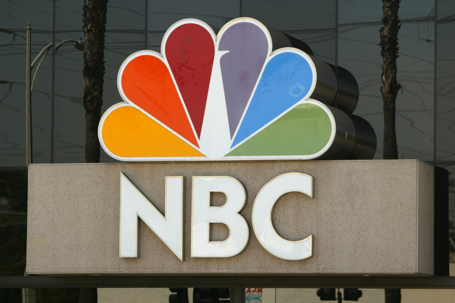
NBC
The NBC logo is one of the most emblematic in the world of television. Known as the "Peacock", it features a bold and colorful design with a stylized peacock with spread feathers. This design represents diversity and creativity, as well as the expansion and global reach of the television network. Since its introduction in 1956, the NBC logo has been a recognized symbol of quality entertainment and diverse programming.
Beats
The Beats logo is distinctive and modern, reflecting the brand as an icon of contemporary music culture. It consists of a stylized lowercase "b" inside a circle. This minimalist yet bold design is instantly recognizable and symbolizes the sound quality and innovation the brand offers in its audio products. Additionally, the circle around the "b" can be interpreted as a representation of the immersive quality of sound that Beats offers. Overall, the Beats logo effectively represents its commitment to excellence in the world of audio.
Photo: Parag Deshmukh/Pexels
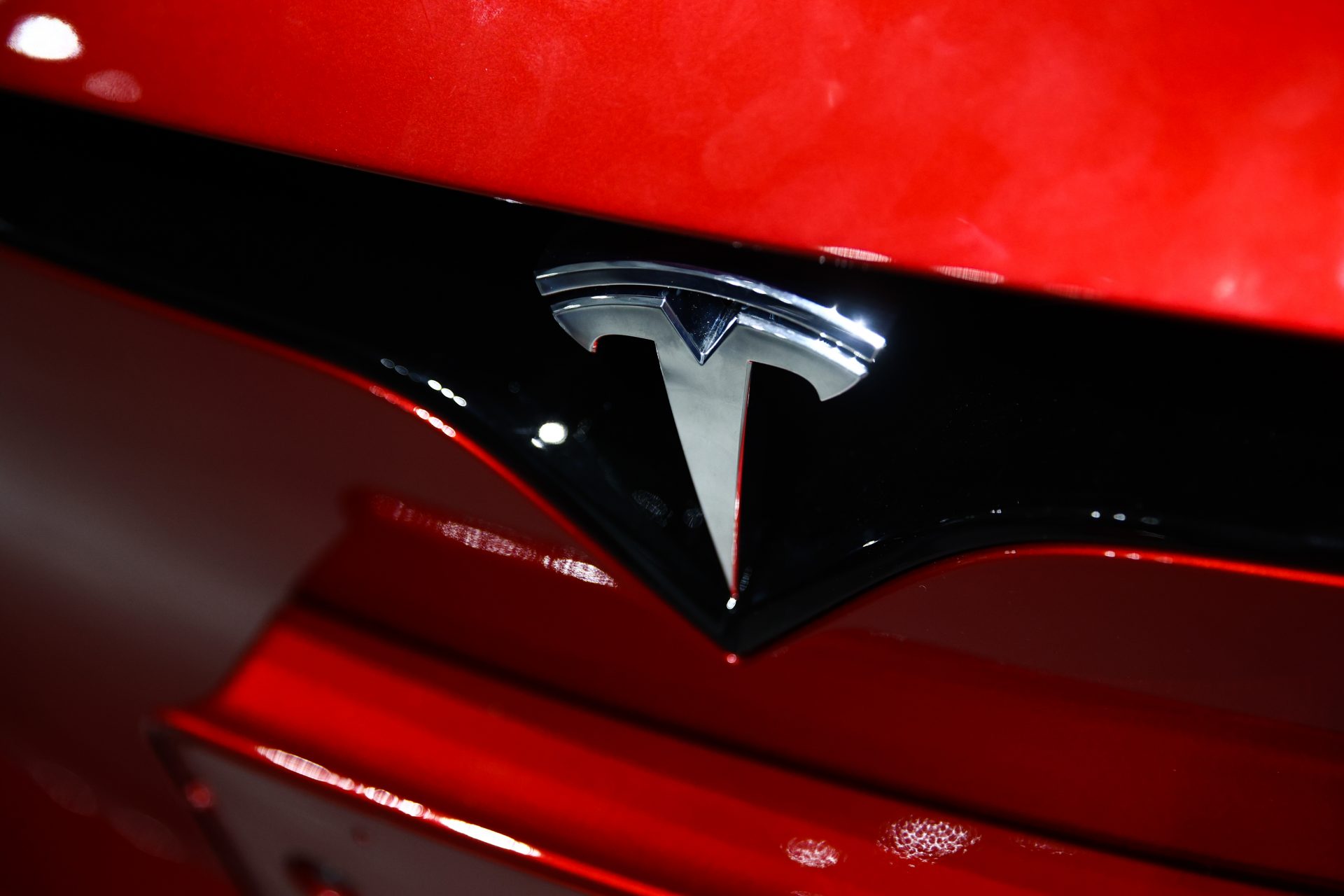
Tesla
In addition to being known for popularizing electric cars, Tesla makes an undeniable impact with its modern-looking logo. More than just a 'T', the emblem also represents a cross-section of an electric motor. The unique version of the letter T, created by RO Studio, initially featured a solid gray shield. However, Tesla designers removed the shield to simplify the design. Additionally, the static monogram conveys dynamic meanings, such as the upward movement that symbolizes the electricity-powered impulse toward the future, according to an article published on Branding Fforum.
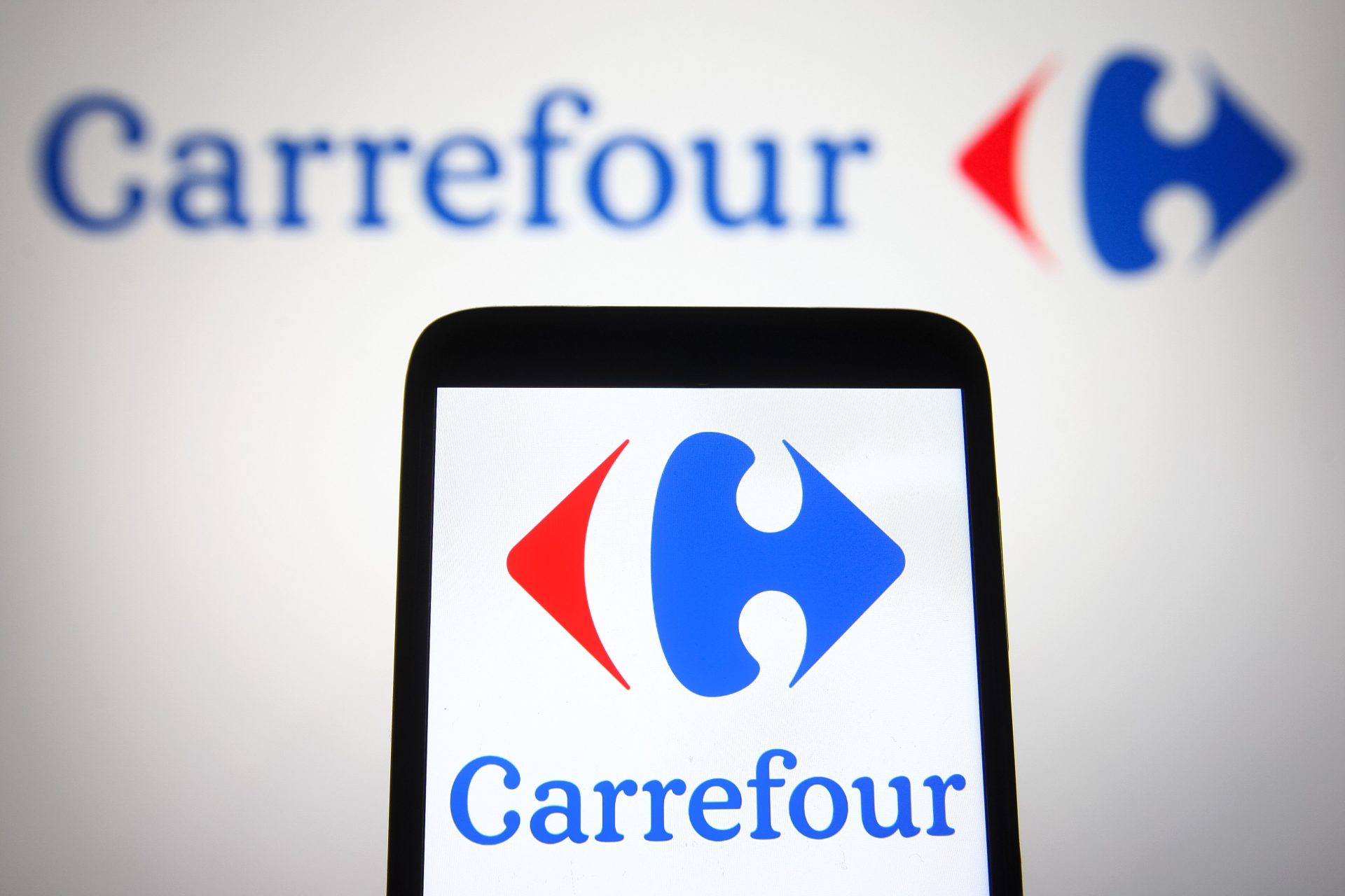
Carrefour
In French, Carrefour means "crossroads." The logo of this company shows two arrows: one pointing left and the other pointing right. Between the two arrows, the letter "C" is hidden, which represents the name of the brand.
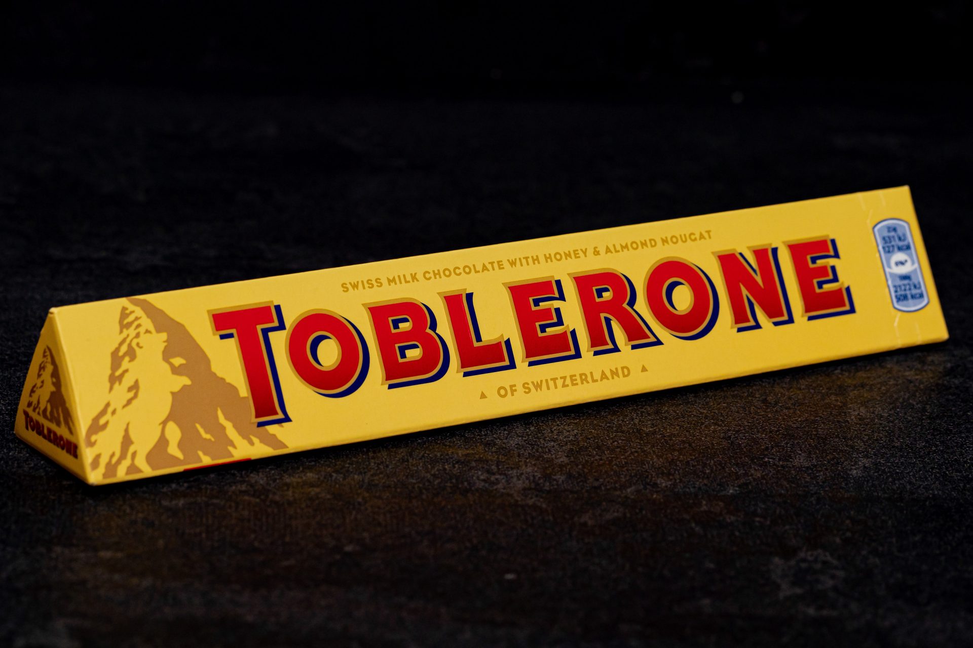
Toblerone
Toblerone's mountain theme is reflected in its famous chocolate triangles and logo. With a unique combination of colors and fonts, the logo evokes the iconic Matterhorn mountain in Zermatt, a well-known Swiss symbol. At first glance, the Toblerone logo appears to be a representation of a mountain, but in reality, it hides an ingenious optical illusion that shows the figure of a white bear in the outline of the mountains. This bear is another tribute to Switzerland, representing its capital, Bern.
Photo: Safwan/Pexels
The evolution of logos
Some logos that have evolved significantly are: Apple, with its bitten apple since 1976; Starbucks, which went from a detailed mermaid to a stylized version; Nike, whose swoosh has changed subtly since 1971; and Shell, which simplified its design since 1900 with its iconic interlocking shells.
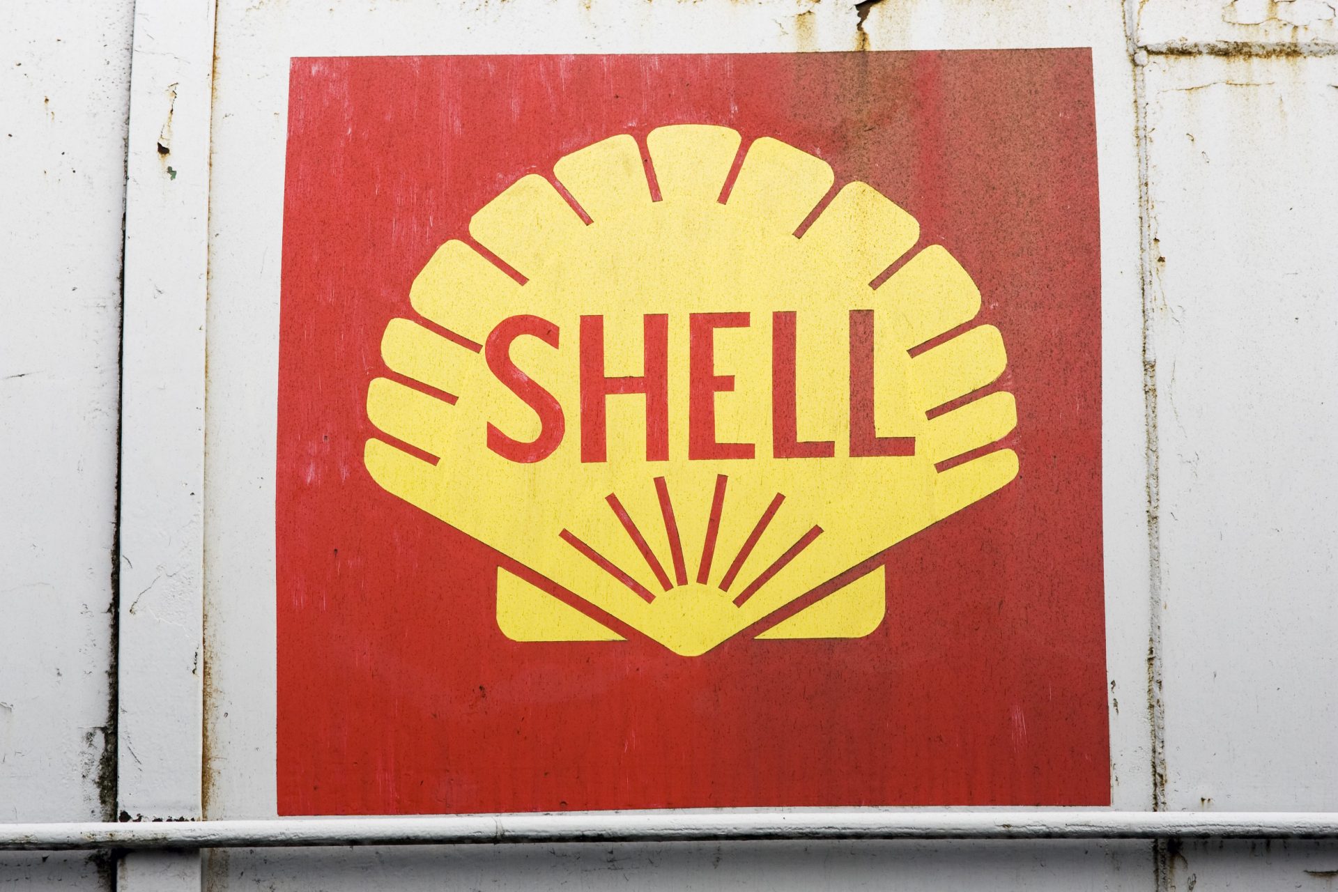
Shell
The choice of a shell to represent an oil company may seem surprising, but that is precisely what the company had in mind. Shell logos often feature a single shell, a reference to the story of its founder, Marcus Samuel, who used to sell boxes decorated with marine mollusks. The current design, created in 1971, features red hollow spikes on a yellow background, showing an Art Deco influence.
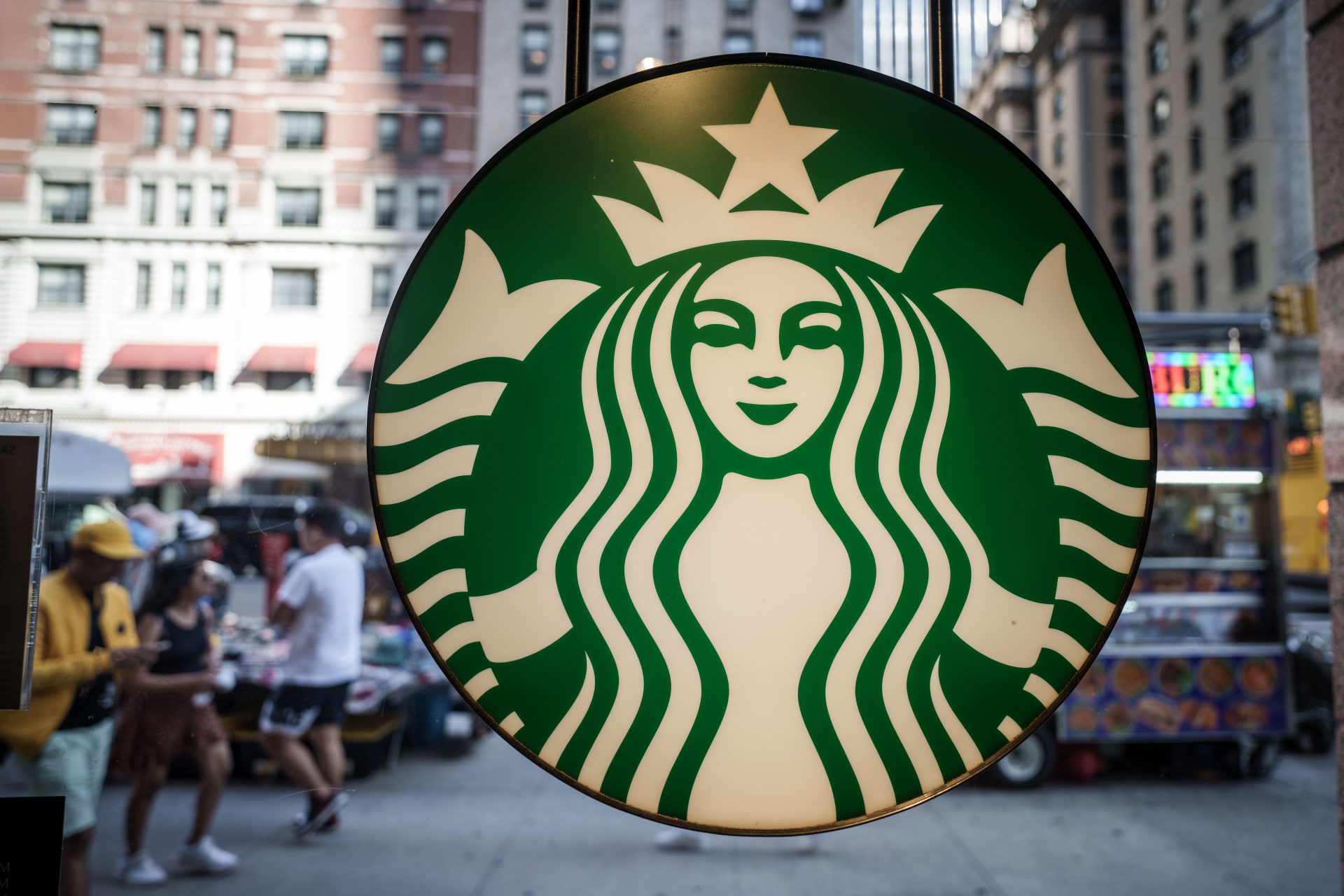
Starbucks
The Starbucks logo is one of the most recognized worldwide. It represents a two-tailed mermaid, which evokes the brand's connection with the sea and maritime culture. Over time, the logo has undergone subtle changes, but has maintained its distinctive essence. Since its creation in 1971, the design has been modernized and simplified, adapting to the evolution of the brand according to an article published on the website Pure Marketing.
Logo design trends for 2024
Logo design for the year 2024 will reflect a continuous evolution in aesthetics and visual communication. From the elegance of simplicity to bold experiments with colors and shapes, logo design for this period promises to be varied and dynamic. Authenticity and emotional connection will continue to be a central theme that will drive creativity towards unique visual narratives and powerful symbols. Elements such as disappearance or disintegration, the integration of natural elements and adaptation to emerging cultural changes will set the tone for the logos of the future according to an article published in WIXBlog.
More for you


Top Stories
1
2
3
4
5


Science and health
Women and men die less when treated by female physicians study finds
27 april, 2024